
7 Quality control tools
7 QC TOOLS – Quality pros have many names for these seven basic tools of quality, first emphasized by Kaoru Ishikawa, a professor of engineering at Tokyo University and the father of “quality circles.” Start your quality journey by mastering these tools, and you’ll have a name for them too: indispensable.

Basic Seven Tools of quality Control
1. Check Sheet
2. Stratification
3. Pareto Chart
4. Cause and Effect Diagram
5. Histogram
6. Scatter Diagram
7. Graph and Control Chart
- Check sheet: A structured, prepared form for collecting and analyzing data; a generic tool that can be adapted for a wide variety of purposes.
- Stratification: A technique that separates data gathered from a variety of sources so that patterns can be seen (some lists replace stratification with a flowchart or run chart).
- Pareto chart: A bar graph that shows which factors are more significant.
- Cause-and-effect diagram (also called Ishikawa or fishbone diagrams): Identifies many possible causes for an effect or problem and sorts ideas into useful categories.
- Histogram: The most commonly used graph for showing frequency distributions, or how often each different value in a set of data occurs.
- Scatter diagram: Graphs pairs of numerical data, one variable on each axis, to look for a relationship.
- Control chart: Graph used to study how a process changes over time. Comparing current data to historical control limits leads to conclusions about whether the process variation is consistent (in control) or is unpredictable (out of control, affected by special causes of variation).

Why to use the Seven Tools?
A Scientific approach to solving problems and making workplace improvements. Helps individuals/teams in diagnosing, solve and prevent problems.
Can be used to solve 90% of workplace problems. Simple yet powerful.
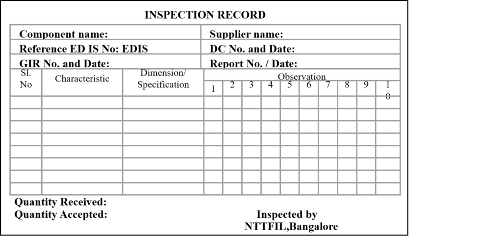
1. Check Sheet – Counting and accumulating data
The check sheet is a systematic method of collecting, recording, and presenting the relevant data in a simple manner.
Rationale and Benefits
To make data gathering simple, systematic, easy, and effective.
To arrange and present data in such a way that it can be understood and used easily.
Enables “management by facts” as opposed to “management by opinion”.
Types of Check sheet
Process performance check sheet.
Defect item check sheet.
Defect location check sheet.
Defect cause check sheet.
Task conformation check sheet.
Steps in making a Check sheet
Establish what information is needed.
Establish an “operational definition” for the data to be collected.
Determine 5W and 2H of the check sheet.
Construct the check sheet.
Test the check sheet.
Use the check sheet.
Use the information (remember three rules of QC).
5W 2H for Check sheet
Why is the data needed?
What type of check sheet should be used?
Where should the data should be collected from? (Plant/machine/place)
Who has to collect the data? (Operator/ supervisor/manager)
When will the data be collected? (Every hour/ at the time of receipt)
How should the data be measured? (Instrument/clock)
How much data is essential?
Construction of the Check sheet
Check sheets should broadly have three types of information.
Title of the check sheet.
Source information
Name of the project/ problem theme.
Location of data collection.
Date and/or time.
Name of the person recording data.
Construction of the Check sheet
Content information
A column with defect/event name.
Column to record frequency.
Column to a record total.
Use the Check sheet
Explain the check sheet to the data collector.
Ensure that the data collector understands the reason for which the data is being collected.
Collect data.
Standardize its use to assure consistency.
Tally mark = 5

Use the information
Pay particular attention to irregular data and irregular conditions.
Use data from the check sheet for further analysis
– Pareto chart, histogram, scatter diagram.
Use the information
Ensure that all the data that is recorded is put to use OR is likely to be put in the future.
Regularly audit the use and usefulness of check sheets.
Process Performance Check sheet
Process Performance Check sheet
Defective Item Check sheet
Defect Location Check sheet
Defect Cause Check sheet
Task confirmation Check sheet
Possible problems with the Check sheet
Goals are too vague
No agreed operational definition
Data is not collected on time
Too much time and effort being spent on recording in the check sheet.
The check sheet is too complex.
Different people are using different check sheets for the same issue.
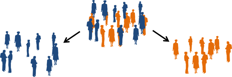
2. Stratification – Divide and Conquer
A technique used to divide the data into sub-categories or classification to provide useful insight into the problem.
Meaning of Stratification
The root word is “strata” which means
Group
Division
Sub-class
Levels
layers
Stratification is an act of dividing the data based on groups, division, sub-class, causes, etc.
Rationale and Benefits
Data comes from different sources. e.g: Different machines, Instruments, Cities, Operators, etc.
Data sometimes masks real information.
Stratification helps in getting meaningful information from data.
Divide the data and Conquer the information.
Example: PCB Rejection
| Time | 3/6 | 4/6 | 5/6 |
| 9:00-10:00 | 15 | 14 | 16 |
| 10:00-11:00 | 1 | 2 | 0 |
| 11:00-12:00 | 2 | 0 | 1 |
| 12:00-1:00 | 1 | 0 | 1 |
| 1:00-1:30 | lunch | ||
| 1:30-2:30 | 10 | 11 | 12 |
| 2:30-3:30 | 3 | 1 | 0 |
| 3:30-4:30 | 0 | 2 | 1 |
| 4:30-5:30 | 1 | 0 | 1 |
Steps in Stratification
List all conditions
Collect and stratify data
Interpret the data
Step 1. List all conditions
- List all conditions that may seem to be cause of the problem.
- – Shift – day of week
- – Location – time of the day
- – Operator – material batch
- – Product – inspector
- – Machine – production batch
- – Inspection equipment
- – Raw material source
Step 2. Collect and Stratify Data
Collect additional data based on classification, if necessary Stratify data based on the classification.
Step 3. Interpret the data
Calculate the average of each classification or plot an appropriate graph. Look for significant differences or abnormalities in data.
Generate a list of possible causes.
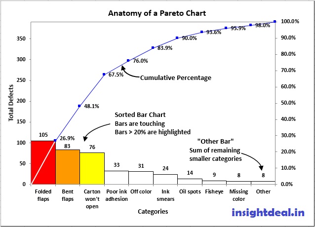
3. Pareto Chart – Vital Few and Trivial Many
A Pareto chart is a diagram that shows the order of the largest number of occurrences by item or by classes and the cumulative sum total.
Rationale and Benefits
Pareto principle: 80% of the Problems come from 20% of the causes.
Distinguishes between Vital Few and Trivial Many.
Displays relative importance of causes of the problem.
Helps the team to focus on those causes that will have the greatest impact when solved.
Steps in Making a Pareto Chart
Select the problem.
Collect data.
Sort data & calculate cumulative frequency.
Draw the axes.
Construct the bars.
Draw the cumulative percentage line.
Title and label the chart.
Identify Vital Few from the Trivial Many and plan further action.
Tips for Making Good Pareto
It is undesirable that “Others” Represent a high percentage (should be < 10%).
If the cause of a problem can be solved easily, implement it even if it belongs to trivial many.
Wherever possible, Compare monetary data with frequency data.
Draw the Pareto chart before and after improvement.
4. Cause and Effect Diagram – Identify and Cure Causes
Rationale and Benefits
Enables a team to identify, explore and graphically display all the possible causes related to a problem.
A cause and effect diagram is good for seeing the whole “Causal” relationship.
Enables identification of root causes and not symptoms.
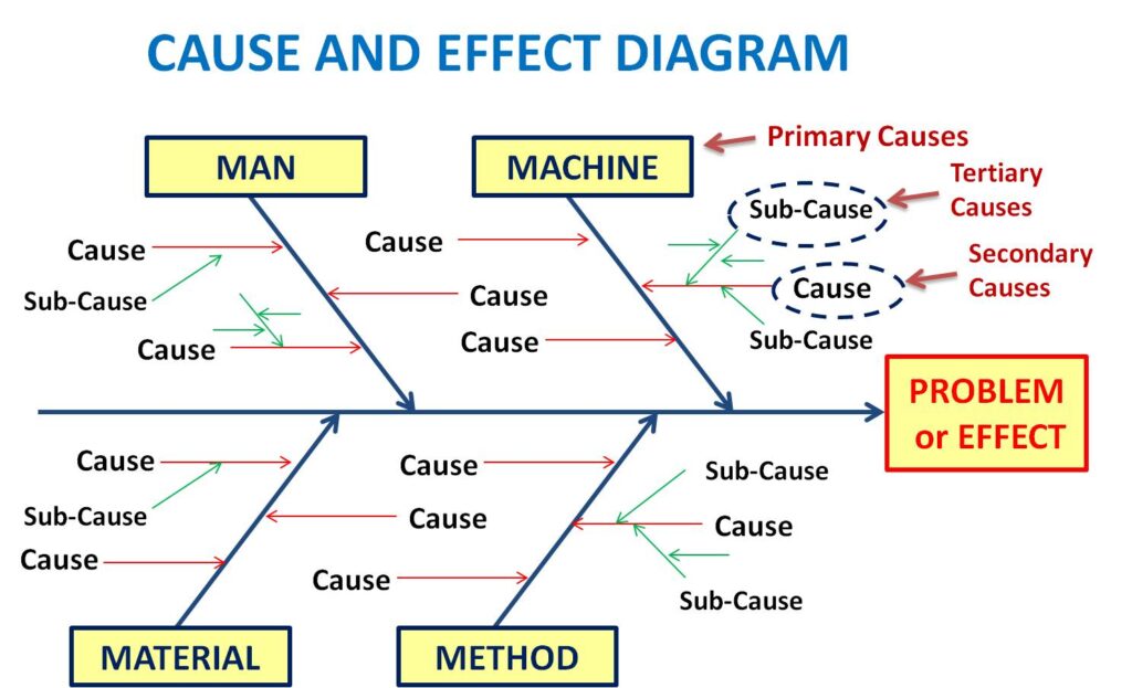
Steps in Constructing Dispersion Type C & E Diagram
State the undesirable effect.
Identify the main cause groups.
Identify causes and sub-causes
Identify potential root cause(s).
Step 1: State the undesirable effect and draw the backbone and draw a line
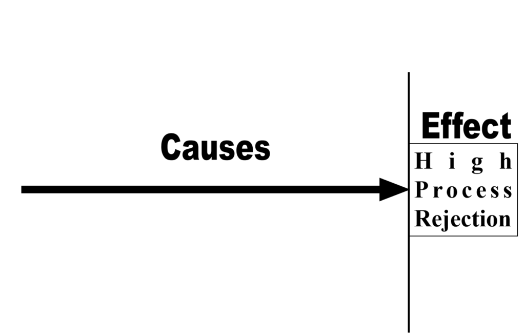
Step 2: Identify the main cause groups such as man, machine, method, material, measurement, tool.
Step 3: Identify the causes and sub-causes. Ask “why” five times
Step 4: Identify the root cause(s)
Identify Significance of Each Cause
Steps in Constructing Process Flow Type Cause and Effect Diagram
State the undesirable effect.
Identify the main process flow diagram.
Identify the causes and sub–causes at each stage of the process.
Identify the potential root cause(s).
Hints for constructing C & E Diagram
Identify all the relevant causes (factors) & the causes most strongly influencing the effect (characteristic).
Express the effect (characteristic) “negatively”.
The linking question between effect and its cause is “why?”.
Make the same number of causes and effect diagrams as that of effects.
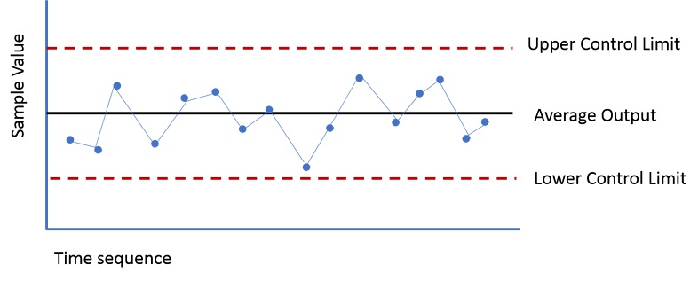
5. Control Chart – Understanding and Reducing Variation
Principles of variation
Every process is subject to variation.
More the variation in the process, the more the loss to the society.
Two types of causes affect variation.
Common cause (also known as the chronic cause, chance cause)
Special cause (also known as a sporadic or assignable cause)
Action on variation entirely depends on the type of cause identified.
Common cause
The cumulative effect of many small and “individually uncontrollable” causes of variation in a process. Express the effect (characteristic) “negatively”.
Special cause
One of a few causes of variation that result in a large variation in the process.
Common vs. Special cause
| Common cause | Special cause |
| Consists of many individual causes | Consists of one or few causes |
| Results in a relatively smaller variation | Results in a large variation |
| The process need not be tampered with | The process needs to be investigated and corrected |
| The process is considered stable | Process is unstable |
Rationale and Benefits
A control chart is used for differentiating between common causes and special causes of variation.
Control charts also help in determining whether the.
Process is stable
Process is capable
It helps in predicting process performance.
Types of data
Variable data – Data that can be measured.
E.g.: Weight, Height, Length, Hardness, Diameter, Angle
Attribute data – Data that can be counted.
E.g.: Defects, Scratches, Dent, Spatters, Blowholes, Cracks.
Classification of control chart
Control chart
Variable data – R chart, X – MR chart, MX – MR chart
Attribute data – p chart, u chart, np chart, c chart
Definition of terms
Subgroups
Smaller groups of sample data were collected over time.
Central line
The average of all the sub-group averages.
Control limits.
The outer limits of “Process Variation”
Steps in constructing Control Chart
Collect the data.
Calculate subgroup average.
Calculate the overall average.
Calculate the range.
Compute the average of the range.
Calculate the control limit for X and R.
Plot the chart.
Interpret the chart.
Step 1. Collect data
Collect and stratify data into subgroups.
| Sub-groups | X1 | X2 | X3 | X4 | X5 |
| 1 | 47 | 32 | 44 | 35 | 20 |
| 2 | 19 | 37 | 31 | 25 | 34 |
| 3 | 29 | 11 | 16 | 11 | 44 |
| 4 | 28 | 29 | 42 | 59 | 38 |
Step 2. Calculate subgroup average
Xbar1 = X1+X2+X3+X4+X5/ n
Xbar1 = 47+32+44+35+20 5 = 35.6Step 3. Calculate the overall average,
Where n is the size of the sub group.
Where n is the size of the sub-group.
Step 4. Calculate the subgroup Range, R
R = Maximum value – Minimum valueR1 = 47 – 20 = 27
Step 5. Calculate the Average Range,
R bar = R1 + R2 + R3 + R4/ k
Rbar= 27 + 18 + 33 + 31 4 = 27.25
Where k is the number of subgroups.
Step 6. Compute Control limits
Control limit for the chart.
Central line = Xbar
Upper control limit : UCL = + A2 .
Lower control limit : LCL = – A2 .
A2 is the coefficient whose value depends on the subgroup size.
Step 6. Compute Control limits for R Chart
Central line = .R bar
Upper control limit : UCL =D4
Lower control limit : LCL =D3
D3 and D4 are the coefficients whose value depends on the subgroup size.
Step 6. Coefficients for – R chart
| Subgroupsize | Chart | R chart | ||
| n | A2 | D3 | D4 | d2 |
| 2 | 1.880 | 0 | 3.267 | 1.128 |
| 3 | 1.023 | 0 | 2.574 | 1.693 |
| 4 | 0.729 | 0 | 2.282 | 2.059 |
| 5 | 0.577 | 0 | 2.114 | 2.326 |
| 6 | 0.483 | 0 | 2.004 | 2.534 |
Step 7. Plot the Control Chart
Vertical axis: Xbar and R values.
Horizontal axis: subgroup number.
Draw the central line: Xbar and R.
Draw the control limits.
Plot the xbar and R values and join the points.
Write necessary items like name of the process, product, size of the subgroup, work conditions, shift, etc.
Stable Process
Random variation and no systematic pattern.
No action required (if Cpk > 1.67)
Rule 1: Points beyond a control limit
Presence of special cause.
Identify root cause and take action.
Rule 2: Run of 7 Points on one side of central line
Presence of special cause.
The process has shifted.
Rule 3: Six consecutive Points Increasing or Decreasing
Presence of special cause.
The process is deteriorating.
Rule 4: Periodicity
Presence of special cause.
Periodic Interference in the process.
Rule 5: Fourteen consecutive points alternating up & down
Presence of special cause.
Identify root cause and take action.
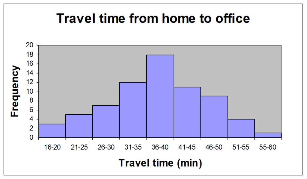
6. Histogram – Charting Dispersion
Rationale and Benefits
Displays large amounts of data, that are difficult to interpret in tabular & graphical form.
Shows the relative frequency of occurrence of the various data values.
Provides useful information for understanding the present performance and predict the future performance of the process.
Rationale and Benefits
Reveals the centering, variation & shape of the data.
Helps evaluate process capability & the question “Is the process capable of meeting customers’ requirements?”.
Enables corrective action to keep the process within specification limits.
Excellent planning and forecasting tool.
Travel Time from Home to Office
Steps in construction of Histogram
Decide on the process measure.
Gather data.
Prepare a frequency table.
Calculate Range, Class intervals, Class width, and Boundaries.
Draw the axes.
Draw the Bars.
Interpret the Histogram.
Interpretation of the Histogram
Process Centering.
Process Variation (Dispersion).
Histogram Shape.
Process Comparison with specification (Process Capability).
5A : Process Centering
Checkpoints for Histogram
Choose critical Process parameters.
Gather as much data as possible.
Choose appropriate class intervals, width, boundaries, and scale.
Specify targets and specification limits.
Take corrective action and verify.
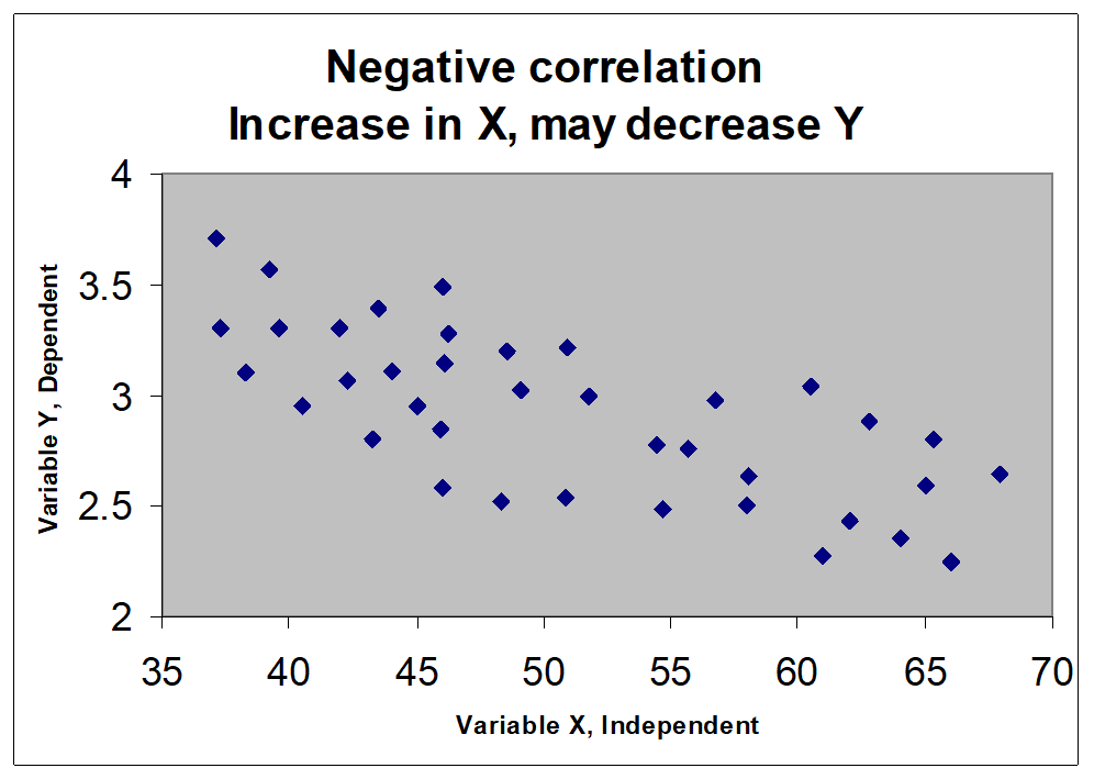
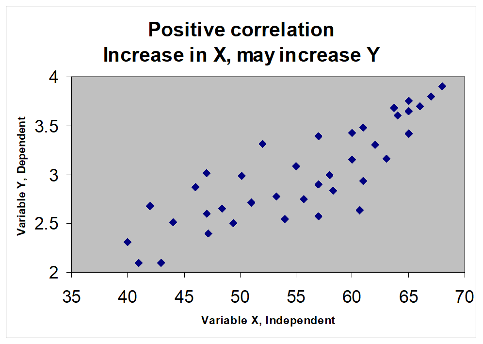
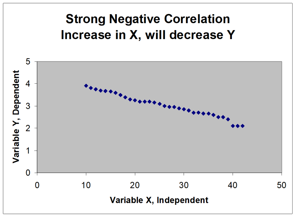
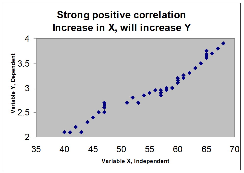
7. Scatter Diagram – Identifying Correlation
A chart was used to study and identify the possible relationship between the two variables.
To identify the possible relationship between the changes observed in two variables.
To establish the
Existence of correlation
Type of correlation
Strength of the relation
Rationale and Benefits
To confirm a hypothesis (assumption) that two variables are related.
Provide both visual and statistical means to test the strength of a potential relationship.
Provide a good follow-up to a cause and effect diagram to find out if there is more than just a consensus connection between causes and effects.
- Examples of two variables
- Cake height and Oven temperature.
- Weight and Height of a man.
- Population & Literacy levels in a state.
- Weight error and Earthing voltage.
- Nonconformance & Operator experience. Hardness and carbon content.
- Inspection mistakes and Illumination levels.
- Elongation of threads and moisture content.
- Child’s height and Father’s height.
- Quality characteristic and the factor affecting it.
Weight and Height of a Person
Capacitance & Line Width
Steps in Making a Scatter Diagram
Collect paired data.
Choose independent and dependent variables.
Draw the axes.
Plot the points.
Label and title the charts.
Interpret the chart.
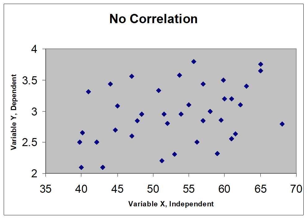
Scatter Diagram Types
